SiteBrowser applet parameters
| Parameter | Description |
|---|---|
| KEY(updated in 2.0.008, obsolete in 2.2) | This parameter is now obsolete, if you are using the old version 2.0p.005 you may contact me through e-mail to obtain appropriate KEY for your site. |
| AUTHOR | Author of this applet, must be exactly "Mark S. Novozhilov (http://www.lordmark.de/SB)" according to usage license terms |
| TREE | URL of a tree structure file to be used (default is tree.txt, see also tree file format). URL can be relative in the context of the html file. |
| ITEMS (new in 2.0.004) | Alternative way to define tree structure. You put your tree file into html code into the ITEMS parameter value, add "%%" at end of each line of your tree structure, except for the last line. Read more about it in packing tree file into html code. If this parameter is specified, the TREE parameter will be ignored. |
| LINKPREFIX (new in 2.0.007) | This prefix is added before any link in your tree structure, which is not an absolute URL. Example: suppose you set LINKPREFIX="sub/page1_". Link specified as "http://www.mypage.com" will not be affected, while link specified as "32.html" will be interpreted as "sub/page1_32.html" in the context of current html page. Default value is empty (not affecting any link). May be useful for dynamical HTML generation. |
| BGCOLOR | Background color, format "rrggbb" (default is C0C0C0). Even if you use background image instead, it still make sense to set this color roughly to the average color of your background image, because shapes are rendered with smoothing, using this color as background. Otherwise you get barely noticeable "nimbus" around the shape. |
| SCROLLBGCOLOR (new in 2.1.0) | Background color, used for the scroll bar. Prior to drawing the scrollbar, the applet will clear the area, covered by the scroller with this color. If not specified, the area is set to the background of a non-active item (if not using color blending effect then it's just normal background). |
| BGIMAGE | Background image URL (optional). URL can be relative in the context of the html file. |
| BGOFFSETX, BGOFFSETY (new in 2.1.0) | Tells the applet that it's area is placed upon the larger area, covered with same image as BGIMAGE, and within this larger are upper left corner of the applet has coordinates BGOFFSETX, BGOFFSETY. Both must be non-negative integers. Default values are 0. This new parameter make it easier to integrate the applet's image to a larger area. |
| TEXT | Text color, format "rrggbbrrggbb_" or "rrggbbrrggbb", first goes text color, then active text color, then "_" if you want the links to be underlined (default is "00007f7f0000_"). Active text color is used when the cursor is over the link. |
| TARGET | Default target window for the links (default is
"_self"). You may override this individually in tree.txt. See tree file format.
|
| BORDER | Border space (default is "5") |
| HSPACE | Integer, space between menu items in menu layout (see MENULAYOUT parameter) (default is 0) |
| AUTOCOLLAPSE | yes/no. If "yes" automatically collapse all expanded items, before expanding next one (very useful for menu layout) (default is "no") |
| MOUSEOVER | yes/no. If "yes" automatically expand an item, when moving with mouse into it (very useful for menu layout). Can be used in combination with EXPANDDELAY (default is "no") |
| EXPANDDELAY(new in 2.0.008) | Integer, time in milliseconds before an item expands when moving with mouse into it. If the user moves the cursor before this time exceed, the item will not expand. Probably more useful in tree layout. Parameter is ignored if MOUSEOVER is "no". (default is 0) |
| MENULAYOUT | yes/no. If "yes" it places the items of top level horizontally, allowing you menu-style view instead of tree-style view (default is "no") |
| RALIGN | full/yes/no. If "full" it aligns all right margins of items in a column. If "yes" it only aligns right margins of items which have same parent. "no" take items as they are. Icons are always aligned. Experiment with this value, you will get nice results in combination with HIGHLIGHT parameter.Default is "no". |
| HIGHLIGHT | format is "aarrggbbaarrggbb". Produces cool highlighting effect with blending of underlying background image. First part of "aarrggbb" is for normal items, and second for highlighted items (which mouse stand over). rrggbb part is color as usual, while aa is transparency. 00 value state for complete transparent color and actually disables blending. ff value state for complete opaque color. Experiment with different colors and transparency to get your favorite look and feel. Also see of aligning (RALIGN) (default is "0011223300112233", you see both transparencies are 00 thus disable blending by default. Cool value to start with is "3200000064ffffff") |
| SMOOTHDOWN | Integer, rate with which items roll out when expanding, measured in pixels per 0.1 second. 0 means instant dropdown. (default is 10) |
| SMOOTHUP | Integer, rate with which items roll in when collapsing, measured in pixels per 0.1 second. 0 means instant collapse. (default is 20) |
| SMOOTHSCROLL (new in 2.1.0) | Integer, rate with which items are scrolled if the user clicks up/down arrows of the scrollbar, measured in pixels per 0.1 second. 0 means instant scroll. (default is 20) |
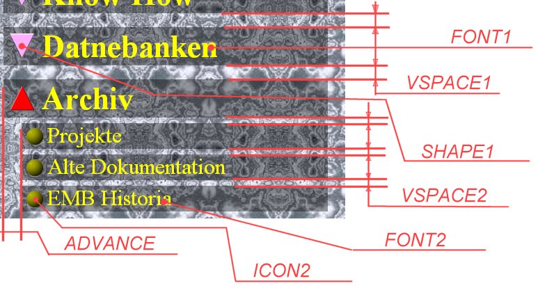
| ADVANCE | Advance in pixels for next sublevel. Items which dropped off an item are placed with this horizontal offset to parent item. Can be overridden by custom item (see tree file format) (default is "12") |
| SCROLLER (new in 2.1.0) | format is "Fn". This parameter tells the applet to enable vertical scrolling if needed. By default items, that don't fit into the applet's area are just cut off. Other way to activate scrolling is to specify one of the custom images for the scroll bar (see next parameters). F is a shape, used to display the slider of a scroll bar. Possible values are same as of the SHAPEn parameter (described below). Good values are i,I,h,H,O. n is the width of the scroll bar in pixels. Instead you can specify your own image for the slider with SLIDERIMAGE parameter. Important note: horizontal dimension of all custom images, specified for the scroll bar must be the same, otherwise you may get visual glitches. |
| SHAPE0 (new in 2.1.0) | Shape, that is used for scroll bar arrows. Format is that of the SHAPEn parameter (described below). Good values for the arrows are v,V,w,W. Instead you can specify your own images with SCROLLUPIMAGE, SCROLLDOWNIMAGE parameters. |
| ICON0 (new in 2.1.0) | Shape, that is used as background for the slider area of a scroll bar . Format is that of the ICONn parameter (described below). The images is replicated vertically to cover the whole area. Good values for the arrows are i,I,h,H. You may find other shapes funny too. Instead you can specify your own image with SCROLLBGIMAGE parameter. |
| VSPACE0 (new in 2.1.0) | Integer, space between the items area and scroll bar area, and also between components of the scroll bar itself, that is arrows and slider area. Default is 0. |
| SLIDERIMAGE (new in 2.1.0) | Format: "image1[|image2]". That is one or two image's URLs, separated by "|". This images must have same dimensions and are two states, normal and activated (when the mouse is over). This parameter specifies custom images for the scroll bar slider. They are used as followed: the image is vertically divided into 3 parts. Middle part is replicated until the total size of the slider is appropriate. |
| SCROLLUPIMAGE, SCROLLDOWNIMAGE (new in 2.1.0) | Format is that of the SLIDERIMAGE parameter. This parameters specify custom images for scroll bar's arrows. |
| SCROLLBGIMAGE (new in 2.1.0) | Image (URL), that is used as background for the slider area of a scroll bar. The images is replicated vertically to cover the whole area. |
| Following parameters
specify properties on a parameter per level base Look at overall concepts for more detail. So, n specify level of depth, while 1 is top level. If a property on a level is not defined, the property of the previous level is used. If top level property is not defined, default is taken. This means, for example, that if you specify property for level 1 and no other level, all subsequent levels get the same property |
|
| FONTn | Defines Font for sublevel n. Format is "fontname
style size". Default is "TimesRoman 2 14". Font names are
case-sensitive. Possible font names are (may differ depending on browser or JDK version,
additional fonts may be available.):
Possible styles are:
|
| VSPACEn | Integer, defines vertical space between items in a level, and also this is space between expanded item and it's first child item |
| SHAPEn (updated for 2.1.0) | Defines shape displayed to the left from node items (those
which have subitmes). Format is "Frrggbbrrggbb".
"F" can have following values (in version 2.1.0):
Then follows shape color and active shape color. Active shape color is used when the
cursor is over the shape.
|
| ICONn (updated for 2.1.0) | Defines shape displayed to the left from leaf items (those which don't have subitems). Format is that of SHAPEn. |
Illustration to some of the applet parameters:
Last modified 29 March 2002 (c) by Mark Novozhilov <lordmark@lordmark.de>